
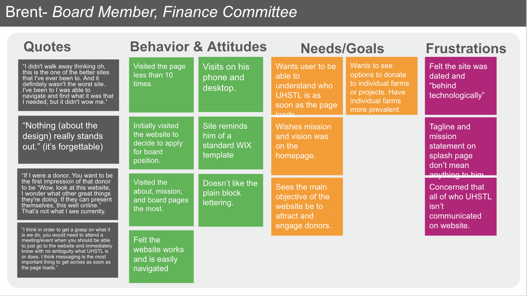
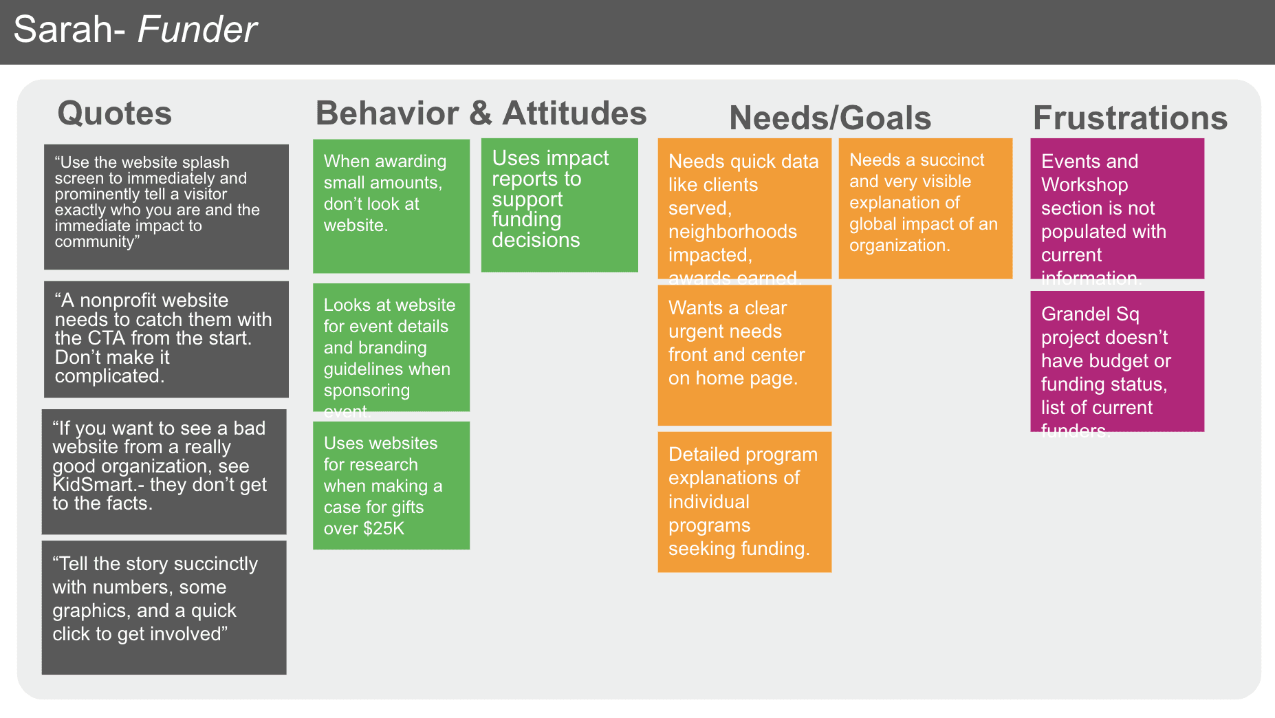
Evaluative Research
Empathizing with the user began with evaluative research method to access the effectiveness of the existing product. After holding initial interviews with the business stakeholders, we developed a list of research goals to drive our UX audit.
Research goals were carefully established to align with the organization's strategic objectives, ensuring a comprehensive understanding of user needs and pain points. To gather diverse perspectives, we conducted in-depth interviews with six key individuals, each representing different facets of the organization—ranging from leadership and staff to volunteers and donors. These interviews provided valuable insights into the various operational arms of Urban Harvest STL, offering a well-rounded view of both internal processes and external engagement challenges.

Quotes
Behavior & Attitudes
Frustrations


Defining the Problem
With solid insights derived from the various types of users visiting the site, we developed user personas to guide future design decisions. These personas represent key audience segments and will ensure the website caters to their distinct needs and motivations. The personas that emerged from the research were:
The Community Program Participant
The Concerned Donor/Funder
The Active Volunteer

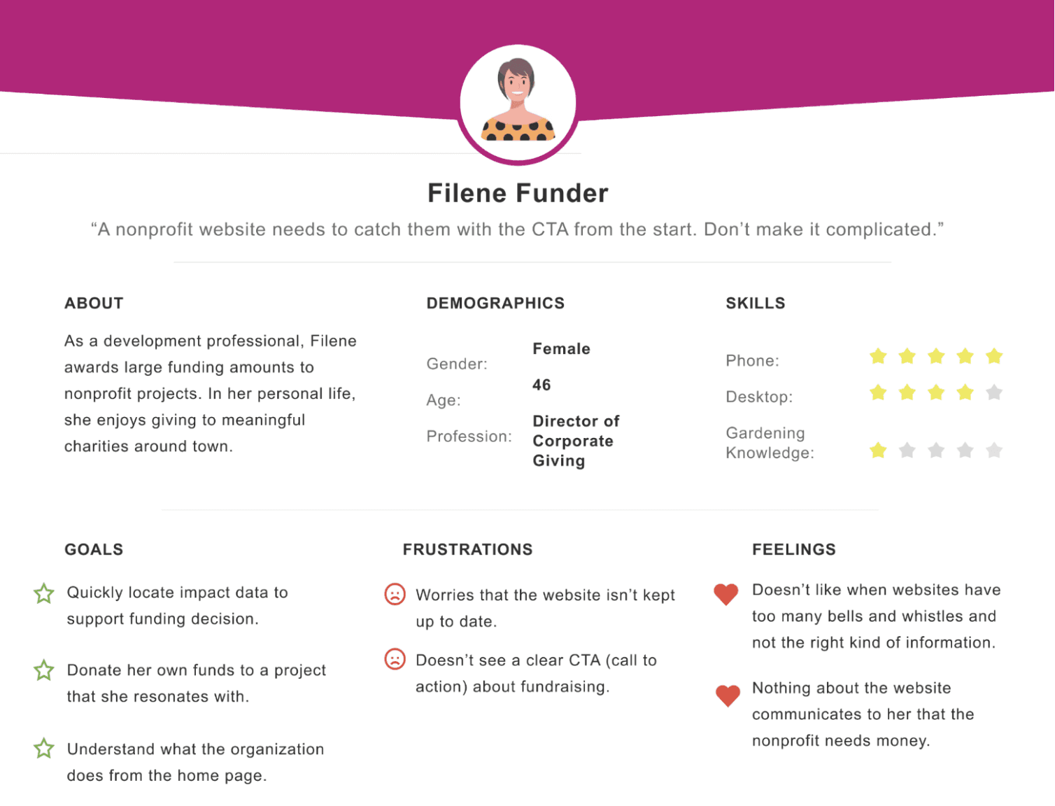
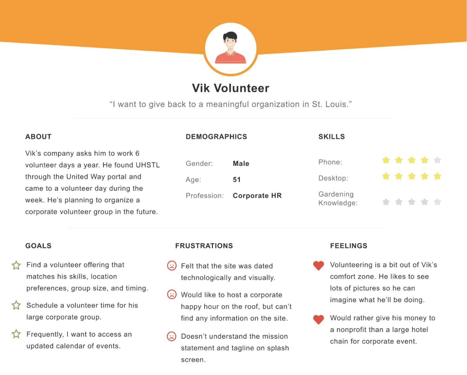
Developing personas was particularly critical in this project because, while the business objectives heavily emphasized building the site to attract donors, it was essential to recognize that users often wore multiple hats when interacting with the site. Our challenge was to design an experience that made all three primary personas—the Donor, the Volunteer, and the Community Learner—feel equally supported and comfortable navigating the site, all while subtly guiding traffic towards the ultimate goal of increasing donations. Balancing these needs required a thoughtful approach to ensure the site didn’t alienate one group while catering to another. We looked at how each user would accomplish their goal on the site, and how they would feel throughout the process. This allowed us to find opportunities for improvement. Here's an example of how our volunteer persona accomplished his task of signing up to volunteer:

There was clearly room for improvement in the flow particularly in the area of error prevention and helping users' recover from mistakes. The final product would need to have plenty of transparency about the volunteer sign-up process.
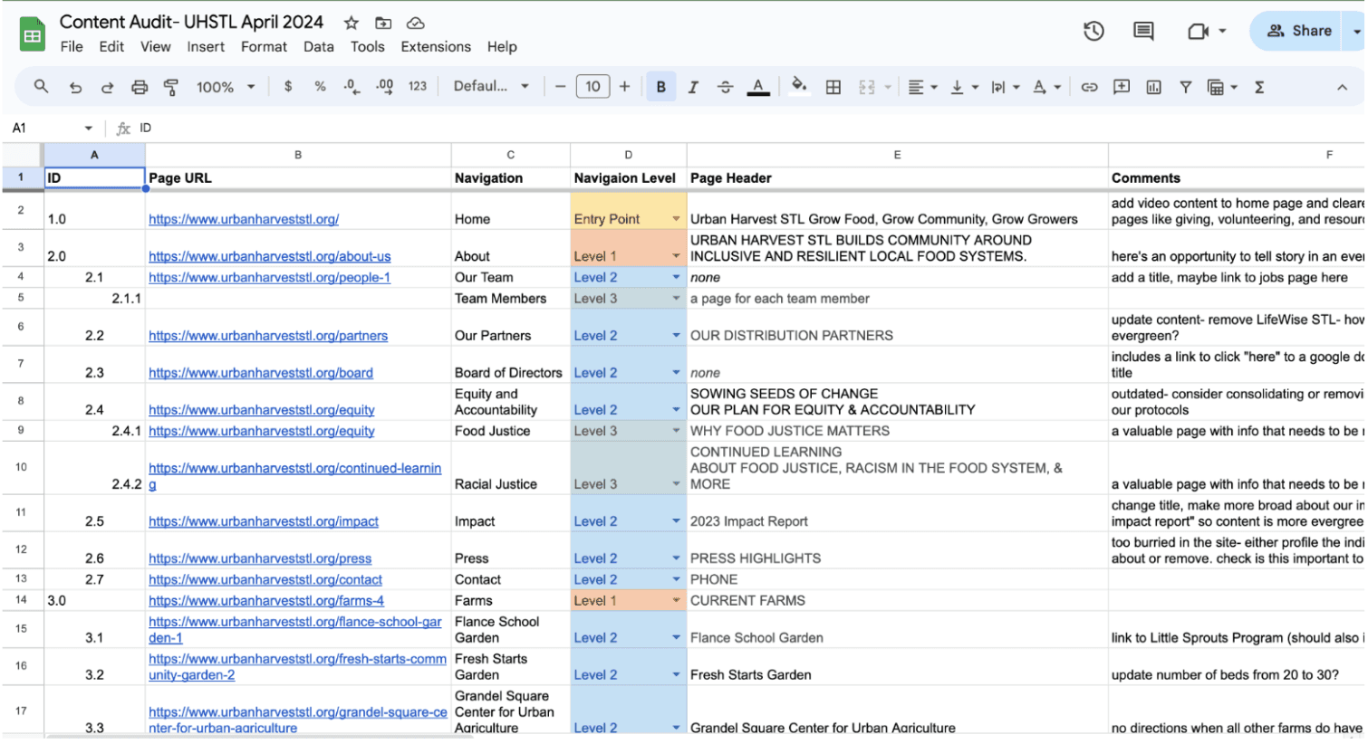
Auditing Content
To further refine the website’s user experience, we conducted a comprehensive content audit. Much of the content was outdated or irrelevant, which created unnecessary clutter and detracted from the site’s effectiveness. This audit allowed us to assess the value of each piece of content and determine what was essential, what needed revision, and what could be removed altogether. By performing this thorough analysis, we were able to streamline the decision-making process and effectively rethink the sitemap, ensuring the content aligned with both user needs and organizational goals.
Analyzing the Market
Next, we conducted a competitive analysis to evaluate four other non-profit websites that engage in similar work to UHSTL. This analysis allowed us to benchmark best practices and identify areas where UHSTL's site could improve in comparison to its peers. We examined factors such as user experience, donation flows, content presentation, and how effectively each site communicated its mission and impact. These insights provided a valuable framework to guide our design decisions, ensuring UHSTL’s website not only met user expectations but also stood out in a competitive landscape.

Restructuring the Sitemap
During the ideate stage of the Design Thinking process, we focused on generating creative solutions based on the insights gathered from user research, personas, and competitive analysis. This stage encouraged us to think broadly and explore various approaches to address the pain points identified in the earlier phases. One key aspect was revising the sitemap to better reflect the users' needs and the organization’s goals.
We restructured the sitemap to streamline navigation, ensuring that key sections—such as the mission, volunteer opportunities, educational resources, and donation pathways—were easily accessible. By simplifying the layout and organizing content more intuitively, we aimed to create a user flow that not only improved the overall experience but also subtly guided visitors towards the donation page, while still catering to the needs of volunteers and community learners. This revision was instrumental in making the site more user-friendly and aligned with UHSTL’s objectives.

The original sitemap was cluttered and unnecessarily complex.

Each sitemap was tested for usability and influenced the final revision.

The revised sitemap is simpler and more focused on programs.
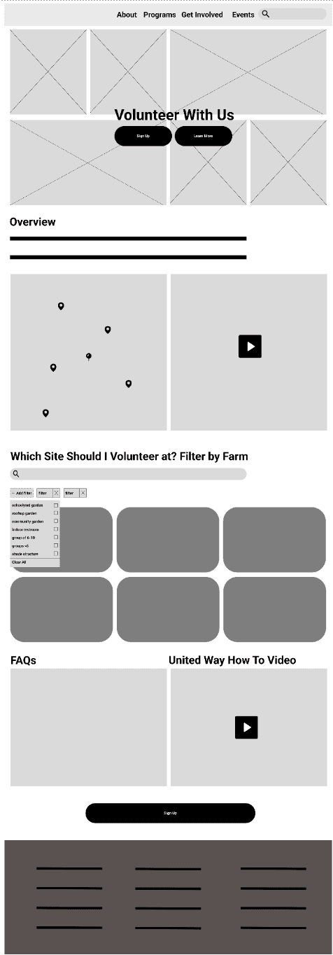
Wire-framing 3 Main Flows
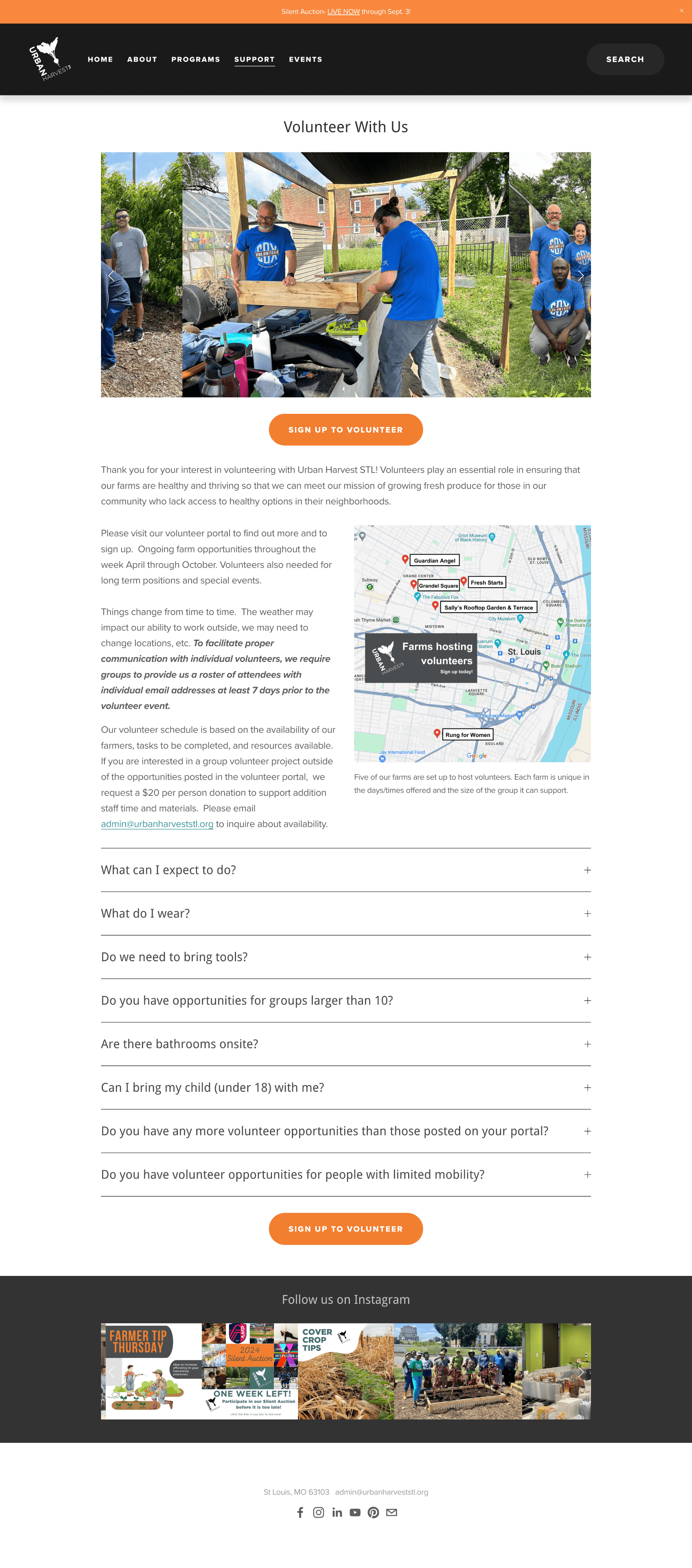
After the ideate stage, we transitioned into wireframing, where we began translating our ideas into tangible visual layouts. The goal was to bring the creative solutions we had brainstormed into a structured format, focusing on the placement of key elements and the overall flow of the user experience. Wireframes served as the blueprint for the website, allowing us to map out essential components—such as navigation, calls to action, and content hierarchy—without getting bogged down by aesthetic details. This stage helped us validate our ideas, ensuring the revised sitemap and user flows would work seamlessly in practice before moving into higher-fidelity designs. We focused primarily on 3 main pages that would need the most comprehensive redesign- Home, Volunteer, and Donate.


Once the wireframes were finalized, we transitioned into the prototyping phase, where we transformed the basic layouts into interactive models that more closely resembled the final product. By building a working prototype, we could simulate the user experience in real time, enabling us to identify any potential issues or areas for improvement.
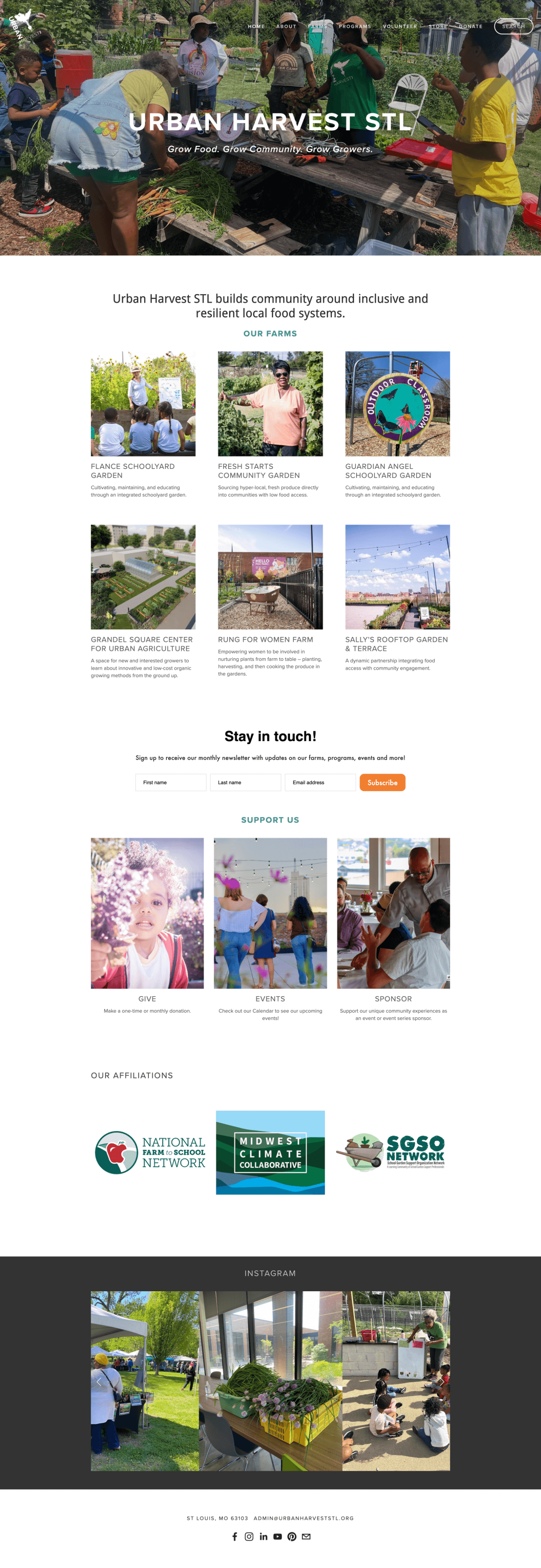
The Results
The new home page quickly gives users an overview of the problem and directs them to how they can help. Other updates include clearer CTAs and more accessible design scheme.

Continual Testing
Finally, we conducted usability testing to observe how users interacted with the site and made refinements based on those insights. One challenge we encountered was the lack of prior Google Analytics implementation for the site. As part of the project, we set up Google Analytics, but the absence of historical data limited our ability to assess the site's performance before the redesign.

No historical data from Google Analytics and low overall traffic to the site makes it difficult to assess success of the latest product.
The business will need to continually monitor the site's performance to be able to make calculated design decisions for future iterations. We were able to teach the stakeholders how to do this before leaving the project.
Reflection
Reflecting on this project, a key insight was the importance of balancing user needs with the organization's goals. While the initial focus was on driving donations, which is critical for any non-profit, user research revealed a more nuanced audience. It wasn’t just about soliciting donations; it became equally important to ensure that volunteers, community members, and educators felt acknowledged and supported through the site’s design. Another major learning point was the need for adaptability. Early design ideas had to be reworked once real user data came in, demonstrating that the best solutions often emerge from stepping back and embracing change. Competitive analysis also played a crucial role, offering insight into how other organizations communicate impact. This prompted a deeper consideration of how UHSTL’s site could stand out without overwhelming users. Additionally, tools like affinity mapping and personas were instrumental in driving the design process. These tools kept the project focused on what truly mattered for the end-user, ensuring that creative ideas aligned with their needs and expectations.