Developing Hypotheses to Guide Research
Generative research for the project was launched with preliminary interviews with homeschooling parents. Through our field research and preliminary interviews, 4 hypothesis emerged that provided guideposts for the project:
Parents feel isolated and wish they had a place to share what they’ve learned and mentor others.
Homeschool parents of children with special needs feel alone because they don’t know any other parents in the same boat.
Homeschool parents don’t have time without their kids to attend in-person support groups or mentor meetings.
New homeschool parents feel overwhelmed without a mentor to guide them.
Analyzing the Market
After defining the problem more clearly, we embarked on a competitive analysis to better understand what similar products were on the market. We looked at other mentor apps to compare features and get a sense of other possible design solutions. A competitive analysis of two leading mentorship apps (Mentor.Social and BetterUp) was conducted.

The analysis consisted of an an evaluation of overall strategy, market advantage, marketing profile, SWOT analysis, and UX analysis (usability, layout, structure, etc.).
User Stories Guide Feature Prioritization
By analyzing competitors, we developed a strategic plan to differentiate the app in the marketplace. Leveraging insights from user research, we brainstormed app features designed to address the challenges faced by homeschooling parents, then created user stories to guide the development of each feature.
From Interviews to Personas
As we refined the product vision, we consistently referred back to the problem statement to ensure a user-centered approach. To achieve this, we conducted user interviews to gain a deeper understanding of the specific challenges homeschool parents face when seeking expert advice, identify pain points and areas of insufficient support, and explore their preferences for how they receive guidance. We interviewed three homeschool parents, organized their responses using affinity mapping, and identified six key themes.
Overwhelming consensus that interviewees distrust the advice of so called “experts.”
Interviewees all suggested the use of filters to find other parents with specific values or expertise.
Interviewees easily thought of unique situations in which they need the help of an expert.
Interviewees want an experienced mentor with similar pedagogy to lean on for support.
Interviewees expressed hesitancy of trusting someone online when they had a network of trusted friends they already leaned on for advice.
Interviewees differentiated between kinds of experts- subject matter vs. parent questions.
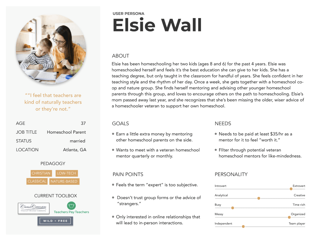
Following the interviews, the next logical step was to create personas to consolidate our understanding of the user. Throughout the conversations, participants often alternated between two roles: that of a novice, seeking guidance, and that of an expert, ready to share their knowledge. The personas we developed reflect both the novice and experienced homeschool parent, while also acknowledging that an individual may switch between these roles at different times. This dual perspective would need to be carefully incorporated into the design.

Mapping the User’s Journey
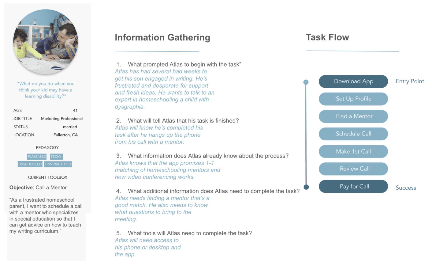
We used these personas to create user journey maps, outlining how users would accomplish their primary goals—the reason they downloaded the app. For the novice, this meant contacting an expert and scheduling a call, while for the expert, it involved creating a mentor profile, setting up a call, and receiving payment for their time. Building these journey maps was a highly rewarding process, as it allowed us to identify potential pain points and uncover new opportunities for improvement through a structured, research-driven approach.

Next, we analyzed specific tasks to determine each persona’s entry point into the app and their key success metrics. For the novice, this involved understanding how they would first engage with the app and what defined a successful experience, such as successfully finding and connecting with an expert for guidance. This task-based analysis allowed us to better tailor the user experience to each persona's unique needs and goals.


Leveraging Usability Heuristics
Before sketching paper wireframes, we reviewed common usability heuristics to ensure the designs aligned with best practices. Using Norman Nielsen’s 10 Usability Heuristics as a framework, we aimed to create a design that was usable—learnable, efficient, memorable, error-tolerant, and satisfying. To further understand how top apps excel in usability, we evaluated the app Clockify against Nielsen’s 10 Usability Heuristics as part of our analysis.
We integrated these usability heuristics into the wireframes, starting with low-fidelity designs for the app's key flows: onboarding, making a call, processing payments, and searching for a mentor. Low-fidelity wireframes offered the flexibility to explore a variety of design ideas without getting bogged down by details. Once the direction was clear, we transitioned to mid-fidelity, and ultimately, high-fidelity mockups to refine the design.
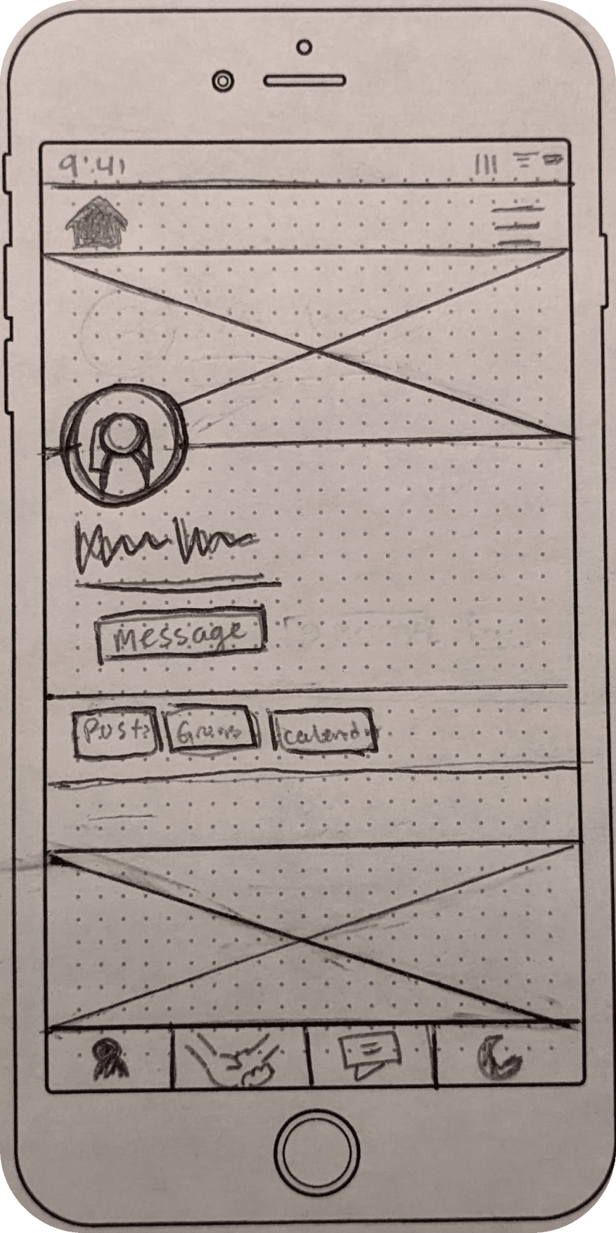

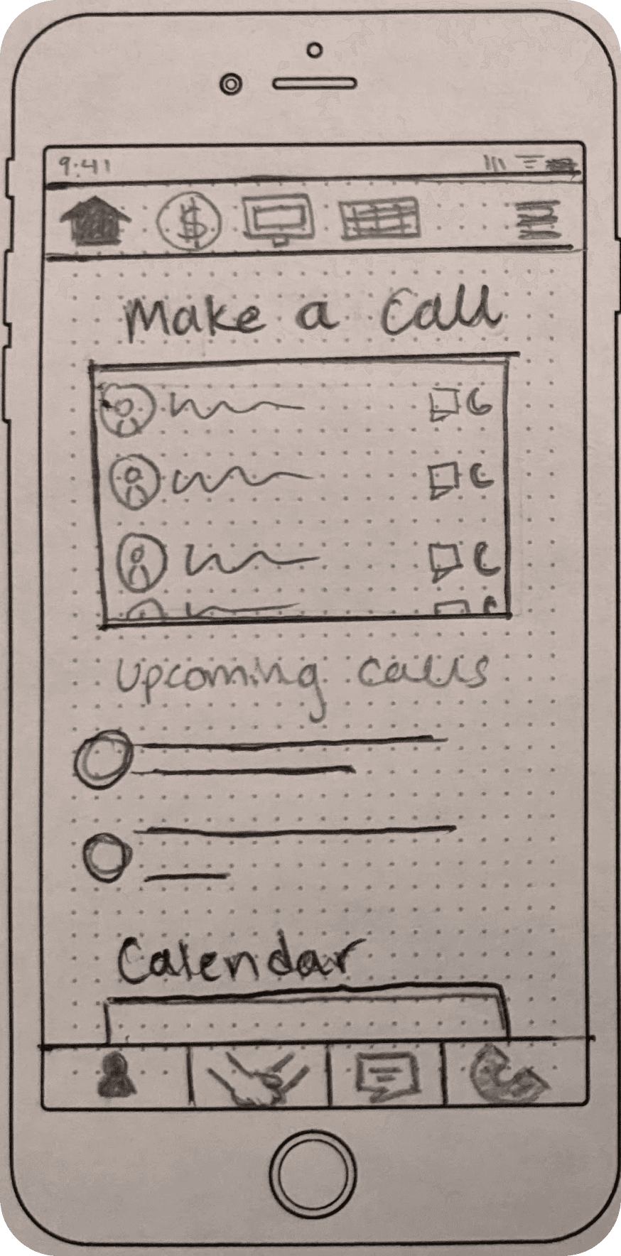
Design began with 3 core flows of the app based on our feature prioritization (calls, payments, and profile).
The wireframing process highlighted the importance of starting with low-fidelity prototypes and progressively developing to a functional design. We fleshed out each main flow. Shown here is the Call flow, which proved to be the trickiest to design.

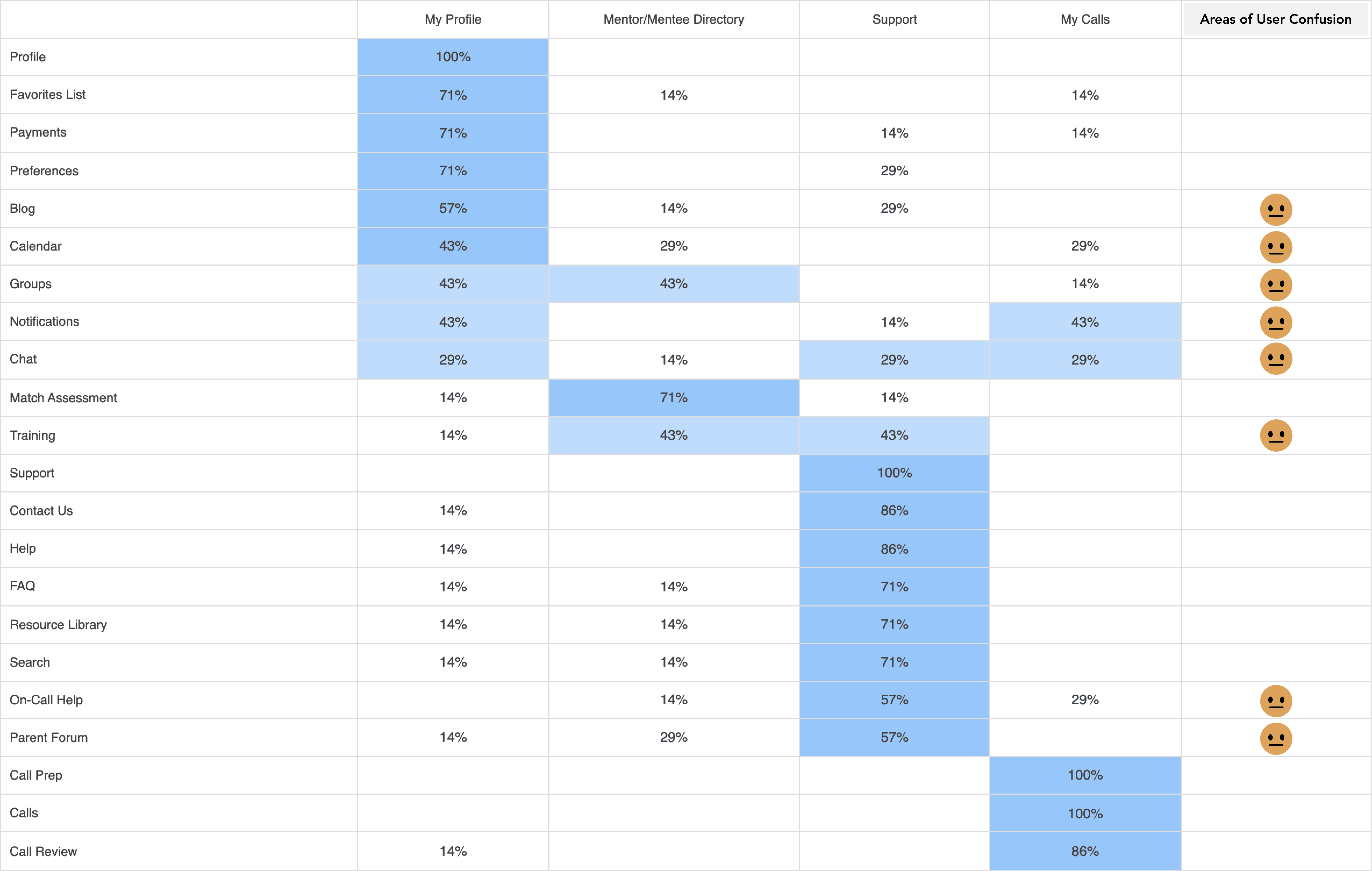
Skipping ahead to visual details, such as colors and final aesthetics, can undermine the effectiveness of the design. In mid-fi wireframes, the “My Calls” screen was not fleshed out sufficiently.
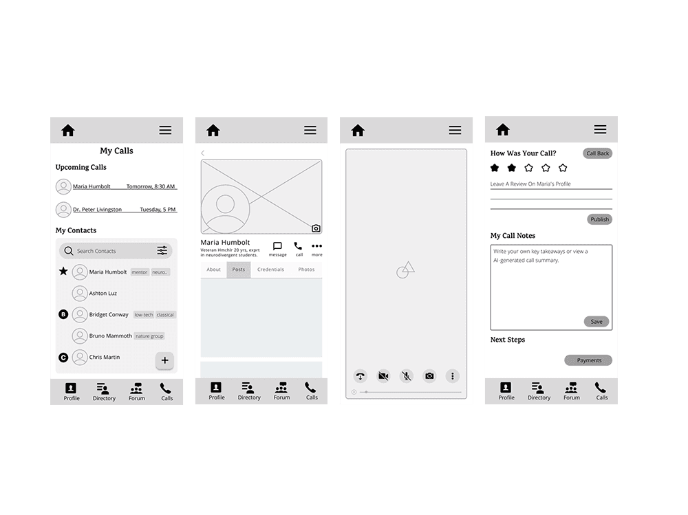
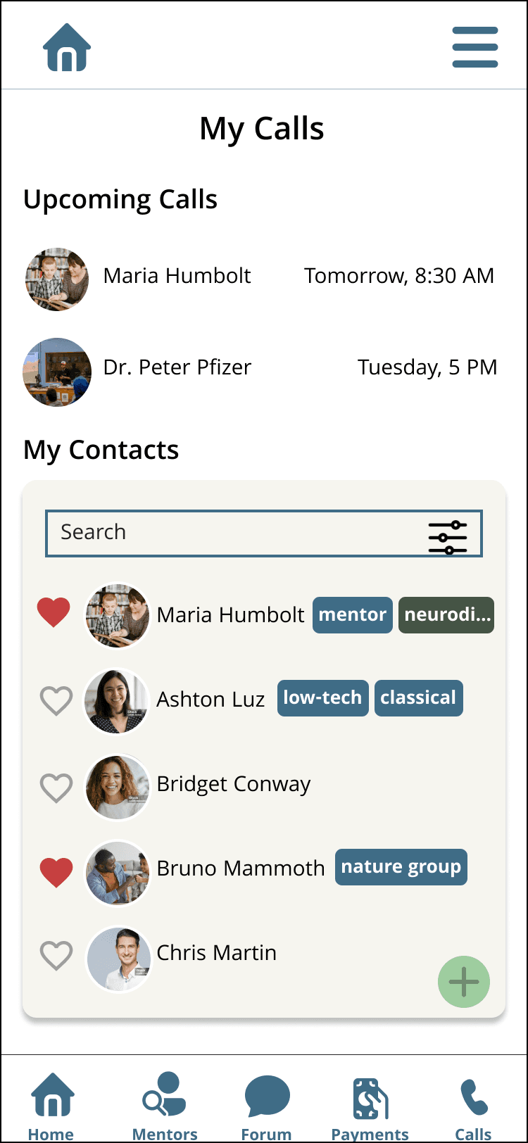
When designing the "My Calls" screen, insufficient attention to the low-fidelity design led to confusion in the high-fidelity mockup. Revisiting the initial research flows and iterating on the low-fidelity design proved necessary. This experience underscores the importance of thorough iteration and the understanding that the design process can be complex and iterative.


Reducing Cognitive Load
Wherever possible, common design features and user interface elements have been incorporated into the HomeCircle design. The platform’s layout draws inspiration from Facebook, given that both are social platforms at their core, with a similar layout and feel for the user profile page to facilitate ease of use. The payment flow is modeled after Venmo’s streamlined process, while the notes feature is designed to resemble Android’s note-taking app. This approach aims to help users quickly adapt to HomeCircle by leveraging familiar design patterns.
Design System
A well-defined design system ensures that the app remains clean, organized, and consistent. For instance, users become accustomed to dark blue buttons indicating primary actions. The predominantly white interface, accented with strategic brand colors, maintains a clean and simple aesthetic, which helps reduce cognitive load and enhances user experience.


A Clean, Modern Look
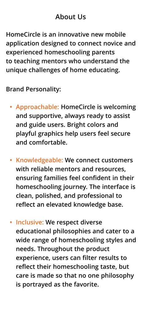
HomeCircle’s brand personality is approachable, knowledgeable, and inclusive. Bright colors and playful graphics help users feel secure and comfortable, and since HomeCircle connects customers with reliable mentors and resources, the brand needs to communicate knowledge to ensure families feel confident in their homeschooling journey. The interface is clean, polished, and professional to reflect an elevated knowledge base. Throughout the product experience, users can filter results to reflect their homeschooling taste, but care is taken so that no one philosophy is portrayed as a favorite. HomeCircle respects diverse educational philosophies and caters to a wide range of homeschooling styles and needs. The brand guide is up to date with WebAIM’s accessibility standards.