The fictional client for this design challenge was Musik- a simple and intuitive music player interface for music lovers to play all their favorite tunes (clearly based on Spotify). The design challenge was open to anyone via Forage's job simulation that partners with companies to create real-life job training opportunities. The Product Design Simulation was powered by Accenture.
As a (fictional) part of the Accenture UX Design Team, our latest design sprint was to create a way for users to see lyrics on the player screen. The challenge mimics a very common scenario for a designer. In Agile, the team is continually working to improve the product based on user feedback. The addition of a lyrics feature has likely been considered before, but now the team has the time and an expected reward (that satisfaction of their users) for building this feature.
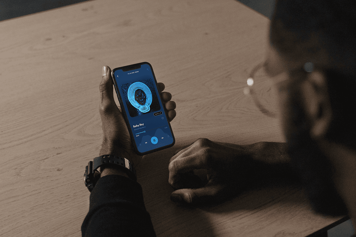
The current Musik version doesn't include an option for users to access song lyrics while listening to a song. Our target audience of young people (iphone users aged 16-25) would like to be able to sing along to a song while listen- offering a karaoke type experience on their very own phone.
I developed the following user stories to help the team focus on delivering value to the user and also to be drive iterative development.
As a user, I want to view the lyrics of a song while it plays so that I can sing along and enjoy the music more interactively.
As a user, I want the lyrics to sync with the song in real time so that I can have a seamless karaoke-like experience.
As a user, I want the option to toggle the lyrics on or off while a song is playing so that I can choose how I experience the music.
As a user, I want the lyrics displayed in a clear and readable format, regardless of my phone's screen size, so I can comfortably follow along.
We used Google Venture's 5 Day Design Sprint framework which focuses on delivering 1 small usable piece of a product at a time. The timetable for a feature development like this would look something like this:
Understand (Day 1)
Teams identify the problem, define goals, and align on the challenge to solve. Research has already been conducted on our target audience and feedback is continually being collected about how users are enjoying Musik. From this research, the team has identified the next feature to prioritize.
Ideate (Day 2)
Designers brainstorm multiple solutions and sketch out their ideas often in a rapid prototyping session where designers can quickly discuss multiple approaches and get team input.
Decide (Day 3)
The team selects the best ideas perhaps by dot voting in a Figma file and creates a low fidelity wireframes of the screens involved.
Prototype (Day 4)
Since the product is so far into production, and the team has a design system to undergird their work, designers are quickly able to develop high fidelity mockups for this small feature.
Test (Day 5)
The prototype is tested with real users to gather feedback and insights, helping teams understand what works and what doesn’t.