My Role
UI Designer
Timeline
10 weeks
Tools
Figma
Lyssna
Mobbin
Project Overview
Fitted is a fitness app concept designed to help users seamlessly incorporate exercise into their daily routines by tracking small ‘micro fitness moments’ (called ‘bursts’) and larger workout sessions (‘blocks’). The app features a personalized onboarding quiz to recommend weekly exercise schedules based on user goals, fitness levels, and available time. Fitted aims to make fitness accessible and achievable, especially for busy individuals.
Problem Statement
Busy individuals often find it challenging to stick to traditional fitness plans, leading to inconsistent exercise routines and diminished motivation. Additionally, many users feel alienated by the branding of traditional fitness platforms, which often feature unrealistic body types and professional fitness models that fail to resonate with everyday users. This creates a sense of exclusion and discourages engagement. The challenge is to provide a solution that is inclusive, adaptable, and empowering for users of all fitness levels.

Defining the Problem
Finding exercise routines for your level can be difficult, especially if you want to try something new. This responsive web app aims to help people get into an exercise of their choice by providing routines, guides, interactive examples, and information.
Finding routines that fit into a busy schedule is also a challenge. The app encourages users to incorporate as little as a 5-minute routine into their day.
Traditional fitness platforms often use imagery and branding that unintentionally alienates everyday users, particularly beginners. By creating a more inclusive and approachable design, this app seeks to bridge that gap.
Who: People new or returning to fitness who want to find activities they enjoy and develop a good routine.
What: A responsive web app allowing users to access routines, guides, daily challenges, and schedule sessions via personal calendars.
When: Users can engage with the app at any time to search, schedule, and follow routines.
Where: The app can be used anywhere, making it versatile for different environments.
Why: To help users become healthier, enjoy associated benefits like improved mood and reduced risks of illness, and make fitness fun and accessible. The app also addresses the emotional barriers caused by alienating branding, creating a space where users feel represented and supported.

Ideating with a User Persona
In imagining how Fitted would serve its users, the team envisioned Rebecca, a software developer juggling a busy work schedule and life as a mom. She struggles to make time for herself and feels discouraged by fitness platforms that display idealized bodies far removed from her reality. Rebecca needs an app that feels like a partner rather than a critic—something welcoming, flexible, and grounded in the real world.
Fitted begins by asking Rebecca questions about her day-to-day routine: "Do you find short moments for yourself between meetings? Would you rather stretch for five minutes or jog for fifteen?" Through this onboarding process, the app gently guides Rebecca toward setting achievable goals, creating a sense of empowerment rather than intimidation.
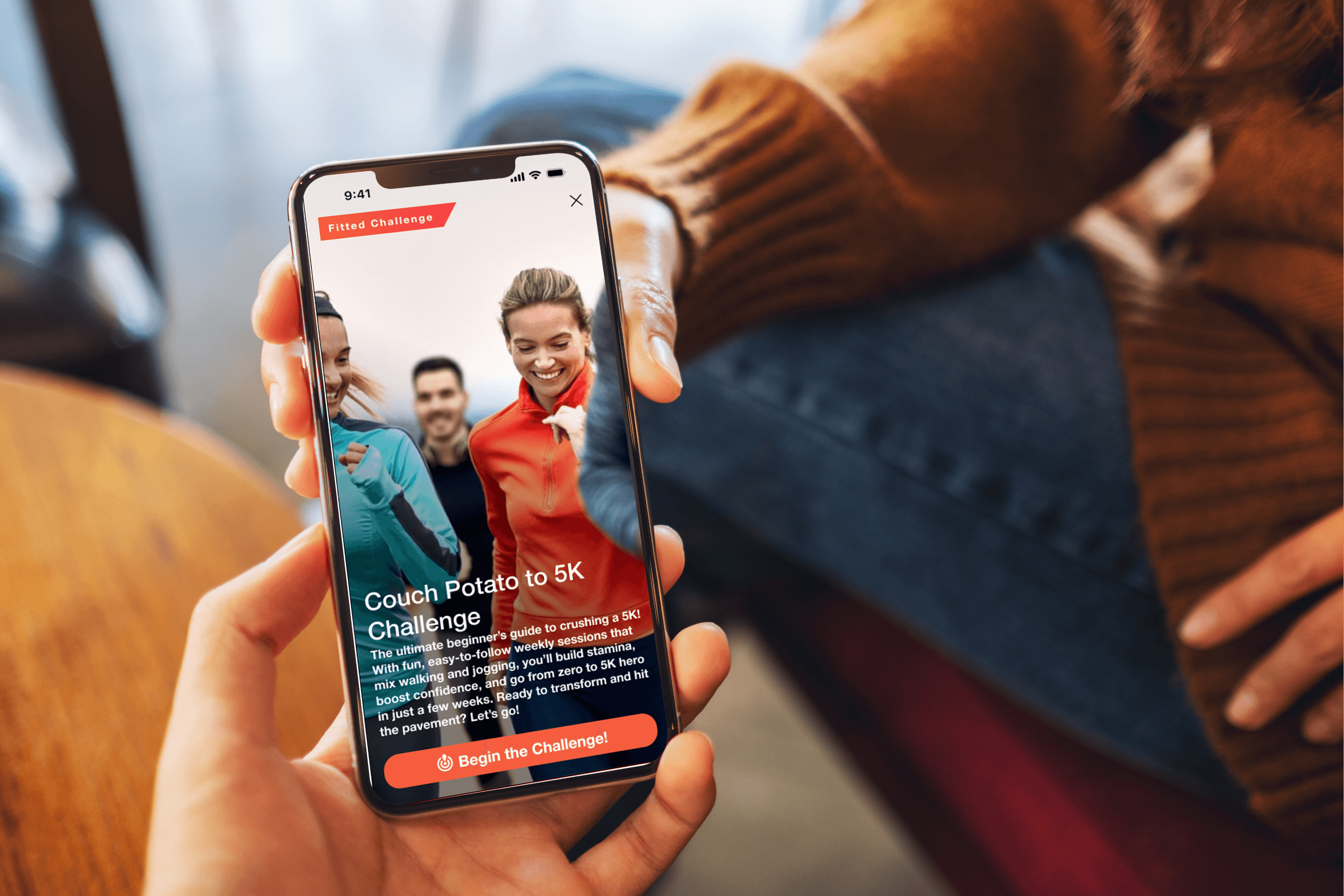
As Rebecca interacts with the app, she notices the thoughtful inclusion of people like her in the imagery and examples: individuals with diverse body types, smiling as they incorporate fitness into their daily lives. This subtle detail makes her feel seen and understood. The gamified challenges inject a bit of fun—earning badges for climbing stairs instead of taking the elevator brings a smile to her face during hectic days. And the "bursts and blocks" tracking system makes it possible for Rebecca to work out whenever and wherever she can, alleviating her guilt about not having a traditional gym routine.
These moments of connection and thoughtful design weave together to make Fitted more than just an app—it becomes a trusted ally in Rebecca’s fitness journey.

Leveraging Task Analysis
A Task analysis was conducted to determine the first three flows critical to the app’s functionality: setting up exercises preference profile, viewing progress and badges, and enrolling in a challenge. This process ensured that the core actions users needed to complete their fitness journeys were intuitive and supported by thoughtful design decisions. From there, the following feature's were brainstormed and ranked by priority.
Feature Brainstorming:
Onboarding quiz to personalize weekly schedules (P1)
Separate tracking for ‘bursts’ (short exercises) and ‘blocks’ (longer sessions) to encourage users to take advantage of small windows of time in their schedule. (P1)
Motivational nudges based on activity patterns. (P3)
Gamified progress tracking (badges, competitions, social element) (P2)
Calendar integration for scheduling workouts so users can track workouts big and small. (P1)
Feature Prioritization: Based on feasibility, user impact, and development constraints, the first focus is to build out the customized onboarding screens, library of filterable exercises, challenges flow, and profile fitness tracker.
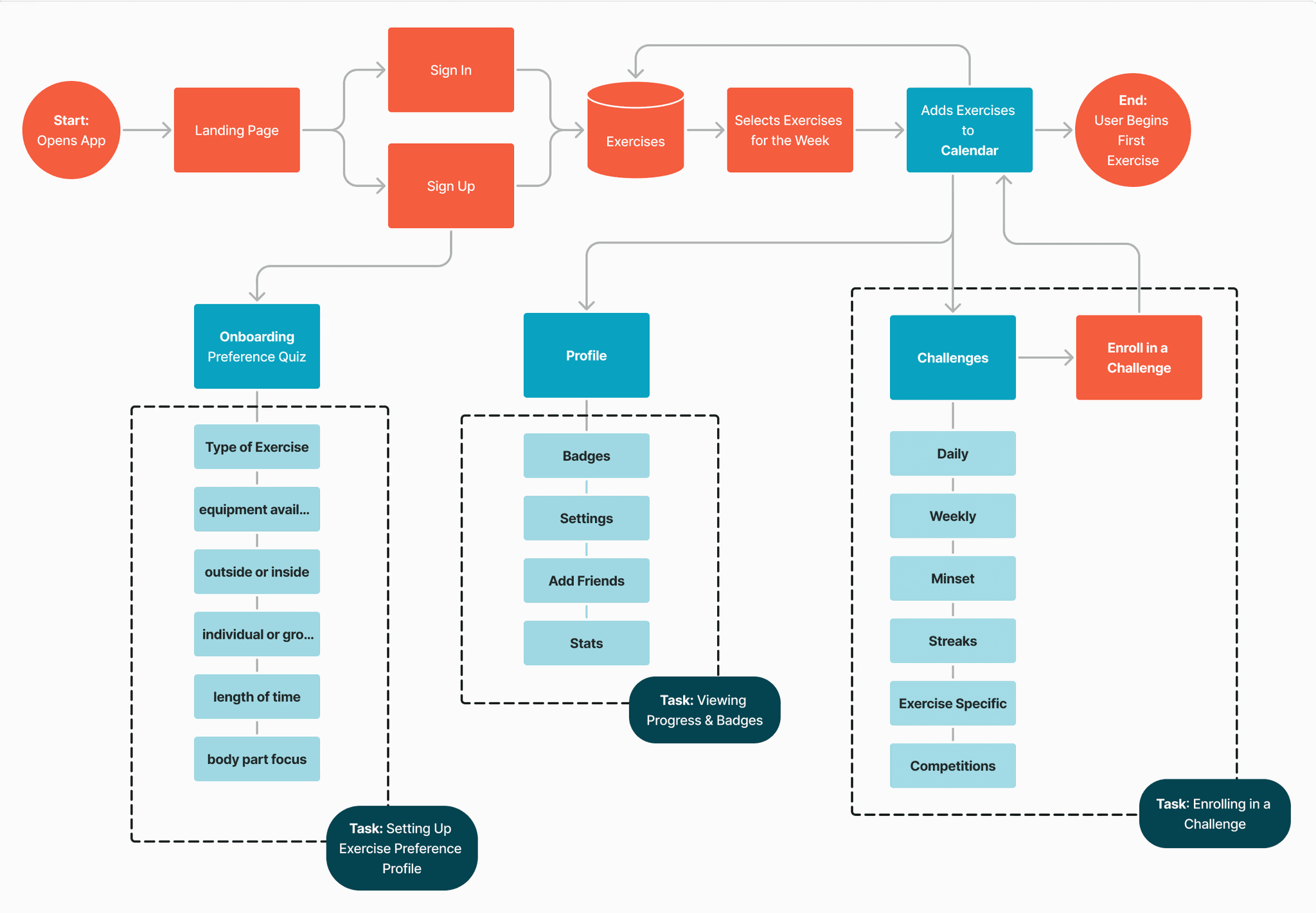
User Flow Chart for 3 Key Tasks
Developing Brand Personality
Developing Brand Personality: To create an approachable and engaging brand identity, mood boards were utilized to analyze references from popular apps like Headspace, Peloton, and Google Fit. Keywords such as positive, fun, easy, step-by-step, teacher, encouragement, dynamism, energetic, and approachable guided the design. This research informed the app’s colors, typography, and visual elements, ensuring alignment with the goal of inclusivity and motivation.


Wireframes: Next, low-fidelity sketches were developed to visualize key screens. Using a rapid prototyping method that confined brainstorming sessions to only 40 minutes, the designs were easily malleable at this point- allowing design work to be quickly edited and adjusted after each feedback cycle.


After some reflection and feedback from peer designers, mid-fidelity designs took shape- focusing mostly on developing a cohesive design grid and ensuring key screens were developed from the user flow map shown previously. A brief (but always important) competitor analysis was also performed and so to repeat common design patterns from great web apps like MyFitness Pro and Map My Run. Some areas for improvement were identified, specifically allowing users to sort by exercise type as well as body part and also giving users quick access to their own calendar with options for daily, weekly, or monthly views. Since the user persona’s main task is to select exercises for her week and try to remain consistent and motivated to stick to her plan, the calendar feature is paramount. The mid-fi designs are below with and without the design grid for reference.


Finally, the designs progressed to high fidelity. The process began with defining the spacing for the design, followed by establishing typography, then incorporating color, imagery, and finally UI elements. This structured approach ensured that each design layer was built thoughtfully and sequentially, avoiding the risk of prioritizing aesthetic details prematurely.

Design System: A comprehensive design system was developed to ensure consistency and scalability across the app. Starting with the fundamentals, the spacing and grid system were defined to create a harmonious layout. Typography choices balanced readability with a modern and energetic feel, while the color palette featured vibrant, uplifting tones to inspire users. Imagery focused on inclusivity, showcasing diverse body types and approachable fitness scenarios to resonate with users of all levels. Finally, UI elements were crafted to be intuitive and visually appealing, combining rounded edges and dynamic interactions to convey energy and approachability.


Prototype
An interactive prototype was created for mobile focusing on key features like landing page, onboarding, profile, exercise library, calendar, and challenges.
Designing for Reponsiveness
Designing Fitted to function seamlessly across devices was essential to creating a flexible and accessible user experience. A mobile-first design approach was adopted, starting with small screen layouts and progressively enhancing the interface for larger devices. This ensured the design maintained its usability and aesthetic integrity across different resolutions. For instance, on larger screens, additional space was utilized to display more content without overwhelming the user, such as side-by-side panels for navigation and detailed views. This adaptability reinforces Fitted’s mission to meet users wherever they are, both in their fitness journey and on their preferred devices.

Reflection
The design journey for Fitted was filled with valuable lessons and opportunities for growth. One of the biggest challenges was balancing feature complexity with user simplicity. There was a constant need to ensure that the app provided robust functionality without overwhelming the user. This required iterative testing and refining to prioritize the most impactful features.
Another key learning was the importance of inclusivity in design. Through research and user feedback, it became clear how alienating traditional fitness branding could be for many users. By emphasizing diversity in imagery, tone, and functionality, Fitted succeeded in creating an environment that felt welcoming and empowering to its target audience.
Finally, the iterative nature of this project underscored the value of flexibility and adaptability in the design process. From initial sketches to high-fidelity prototypes, the app evolved significantly based on user insights and testing. This iterative approach not only enhanced the final product but also reinforced the importance of keeping the user at the center of every design decision.
Looking ahead, the next steps for Fitted include exploring additional features like community challenges, integration with wearable devices, and partnerships with fitness professionals. These enhancements will further solidify Fitted as a comprehensive and user-centered fitness solution. Overall, this project demonstrated the power of thoughtful, inclusive design to create meaningful and impactful user experiences.